Subscribe:

Labels

Showing posts with label Economics. Show all posts

Saturday, 15 December 2012

Australia: the world's fastest growing large rich country

In the decade between 2000 and 2010, Australia's population grew by 15.1%, more than any other large rich country. Spain was second with 14.4% growth and Canada was third with a 14.4% increase.

Population growth in IMF advanced economies with a population greater than 10 million, 2000-2010

Despite the country facing many of the same demographic challenges as other rich nations - namely an ageing population and a declining birth rate - it has managed to sustain strong population growth. This growth has been largely fueled by immigration; for example, in 2009, Australia had the highest rate of per-capita immigration in the OECD (the world's rich country club) in 2009.


Relative population growth 1980-2015,  top ten advanced economies

If smaller advanced economies are included in the analysis, only Singapore, Israel and Cyprus have outpaced Australia since 1980. When taking the IMF's 2015 population estimates, Singapore's growth rate is 123% during the period 1980-2015. Israel's rate is 119%, the growth rate for Cyprus rate is 78% and Australia comes in at 59%.

As the twelfth-emptiest country in the world, Australia certainly has the physical capacity to keep up its high rate of population growth. This is a key strength of the Australian economy as it can supplement its resource-led productivity gains with population-derived gains.

Friday, 3 August 2012

The gender pay gap

It is hardly revelatory that men earn higher incomes than women than women in Australia. The 2011 Australian census confirms this, and provides the opportunity to break down the salary gap by geographical area.

The gender pay gap in Australia across geographical areas
The income difference between males and females, by geographical area

The chart above looks at ABS Statistical Area Level 4 (SA4) regions in Australia, and provides a visual representation of the equivalent salaries in each. So, for example, where males in the Latrobe - Gippsland area earn an average of $771 each week, women earn $500 per week.


Male-to-female income ratio, top five and bottom five
The top five and bottom five areas by male-to-female income ratio. Inner city Sydney has the closest gap between males and females, and the area around Mackay in Queensland has the largest gap.

The chart above shows the top five and the bottom five areas in Australia for the ratio of male-to-female incomes. Male residents in inner city Sydney earn 1.23 times the income compared with females in the same area. Inner city Melbourne has a similarly close ratio at 1.25. Two other areas of inner Sydney plus the New South Wales Mid North Coast complete the five most balanced areas in Australia. The clear trend here is that most of the areas here are highly urbanised, high density areas. These are also areas generally dominated by service sector work.

At the other end of the scale, the area around Mackay in Queensland has the largest ratio. Men earn 1.87 times the income compared with women in this area. Mandurah, Bunbury and the Outback areas of Western Australia and the Fitzroy region of Queensland round out the top five areas by gender income inequality. The main trait shared by these areas is that most have significant mining activities occurring within their boundaries.

Wednesday, 1 August 2012

The cities vs regional Australia: How do earnings compare?

Regional Australia is a term coined by the Australian government to describe areas of Australia outside of the big four cities (well not quite this definition, but it's close enough). Successful, modern cities such as Sydney, Melbourne, Brisbane and Perth are magnets for productive, educated labour from all over the world. The magnetic appeal of Regional Australia to skilled labour is, in contrast, limited. In order to satisfy labour requirements, the Australian government entices suitably skilled labour to Regional Australia through fast-track visas and other incentives. The 2011 Australian census presents an opportunity to partition data by geographical area and therefore allow us to perform a comparison between Regional Australia and its state capitals.

I recently posted about income distribution across Australian states, which included income equality analysis based on standard deviation measurements. The logic behind this approach is that a wider spread of incomes indicates a higher degree of income inequality. The chart below shows relative standard deviation, i.e. the spread of incomes relative to the mean value. This relative figure solves the problem where a lower average income compresses the spread, making lower income regions appear more equal.

Regional WA is the most unequal area in Australia
Relative standard deviation i.e. the spread of incomes relative to the mean income. This is an indicator of income inequality where the larger the percentage, the greater the inequality.


As can be seen above, regional Western Australia appears to have the highest degree of income inequality in the country, when measured by relative standard deviation. It even surpasses Northern Territory, the state/territory with the highest level of inequality covered in my previous post. The Western Australia section below covers the issue of regional WA income inequality in more detail..

New South Wales

Australia's most populous state exhibits a stark contrast between Sydney and the rest of the state. Household income in regional New South Wales rises sharply to form a tall spike with a mode around $900 per week, then tapers away to almost zero by the $2,200 point. Sydney forms an entirely different income profile, with a more even spread across a range of income levels, with the most common income bracket being $1,300 per week.


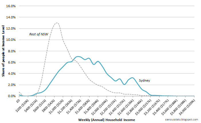
Income distribution in Sydney vs the rest of New South Wales

The mean Sydney weekly income is $1,556 per week, equivalent to $81,203 per year, whereas regional NSW residents earn a mean $1,051 each week ($54,829 per annum), which is equivalent to 48% less than in the city. 

Queensland

Queensland is unique among Australian states in that its state capital, Brisbane, does not dominate quite to the same extent as capitals in other states. The second city in Queensland, Gold Coast, also doubles as Australia's fifth largest city, albeit one that is slowly merging with the capital over time. The Gold Coast is not classified as Regional Australia and if it was measured simply as 'non-Brisbane Queensland' then it could skew the results for regional Queensland significantly. It is for these reasons that both Brisbane and the Gold Coast are separately assessed for Queensland.

Income distribution in Brisbane vs the Gold Coast vs the rest of New South Wales

What we see in Queensland is that the Brisbane is significantly wealthier than regional Queensland, and the Gold Coast sits somewhere in between the two. When measured by relative standard deviation, regional Queensland has higher levels of income inequality than the cities of South-East Queensland.

The Gold Coast and Brisbane have a fairly similar profile, and this may be expected given that the two cities are within commuting distance and therefore share significant portions of their economies with each other. There are two key differentiators between the two cities however. The Gold Coast has a bimodal profile in that there are spikes around both the $1,000 and the $1,400 per week bracket. Brisbane follows a more typical profile of having a single peak around $1,400 per week. The second key difference is that there are far more high earners in Brisbane than in the Gold Coast. For example, only around 0.5% of Gold Coast residents indicated that their household earned $2,300 per week ($120,000 per year). Of the Brisbane-based respondents, approximately 2.3% indicated that they earned this amount i.e. 4-5 times the frequency.

Victoria

Regional Victoria stands out as having the most extreme spike around a single income bracket. Around 16% of regional Victorians - around 1 in 6 - indicated a household income of $900 per week. This can be interpreted as indicating a high degree of income equality. Regional Victoria ranks third lowest in terms of relative standard deviation, further supporting its claims to higher income equality.

Melbourne-based residents earn significantly more than those in the regional areas. For example, only 6% of Melbourne households earn $900 per week and the most frequent income bracket is $1,400 per week.

Income distribution in Melbourne vs the rest of Victoria

Victoria is the only state in Australia where its capital has higher inequality than its regions. This can perhaps be attributed to a lack of mining activity in the state relative to other states.

Western Australia

Western Australia - the primary recipient of mining boom economic effects - appears to have the closest correlation between its capital, Perth, and the rest of the state. With a mean household income of $1,520, Perth households earn approximately $200 more than their regional counterparts. As a key base for FIFO mine workers, and the location of many mining offices, Perth is a city that is reaping the benefits of the growth in the resource sector.
Income distribution in Perth vs the rest of Western Australia
Two characteristics stand out for regional Western Australia. One is the quantity of households earning no income each week, and the other is the significant spike at the $2,800 per week mark ($146,000 per year). Over 2% of regional Western Australian households report no weekly income. This is approximately double the rate seen in other areas measured here and many times the frequency seen in Perth.

At the other end of the income spectrum, almost 3.5% of regional Western Australians report an annual household income of over $146,000 each year. Of the areas measured here, only Sydney-based residents come remotely close to this, with around 2% reporting incomes at this level.

Regional Western Australia has the highest income inequality in Australia, when measured by relative standard deviation. Its relative standard deviation of 53% is thanks to a standard deviation of $690, and a mean income of $1,305. In comparison, the Northern Territory's relative figure is 47%, Perth and Brisbane's is 39% and the figure for the Australian Capital Territory is 34%.

Saturday, 21 July 2012

Income distribution in Australian states

Although the Occupy movement is under less media spotlight than in late 2011, there have been numerous claims in the media of increasing wealth inequality in the developed world, and most notoriously in the United States. The 2011 Australian census presents an opportunity to analyse income distribution and subsequently determine to what degree claims of inequality are borne out in the data.

Household income distributions across Australian states and territories, based on 2011 census data

At the lower end of the income scale, Tasmania stands out as having a significant spike with its mode at 14.5% of respondent households reporting income of $900 per week, which is equivalent to $47,000 per year. South Australia also has a similar, but less extreme, mode with 12% of households reporting income of $900 and similarly 12% reporting $1,000 per week. The tall, narrow profile of these the income distributions for these two southern states paints a picture of states with relatively high levels of income equality. These higher levels of income equality are quantified through the smallest standard deviations of all states (see chart below).

The big population states: NSW, Victoria and Queensland

While Tasmania and South Australia stand out as the lowest earning states, buried beneath them in the chart is a tangle of lines representing the core of Australia's population: New South Wales, Victoria and Queensland. These three states comprise 77% of the Australian population, and follow very similar income distributions (sharing correlation coefficients > 0.98). Victoria has the lowest mean income and smallest standard deviation, News South Wales has the highest, and Queensland is in between; however these differences are subtle and all three have similar levels.

Of the three high population states, one element of note is the minor spike in New South Wales at the $2,600 per week level ($135,662 per annum). This income level is at the 97th percentile in New South Wales, the 98th percentile in Queensland and the 99th percentile in Victoria.

Overall, however, these three states can be summarised as residing in the middle in terms of both mean income and levels of inequality. Victoria, New South Wales and - to some degree - Queensland export a relatively large quantity of services. While this can temper a boost from resource booms, it also reduces their exposure to negative phases in the commodity cycle. This level of diversification, combined with higher populations,  leads to more moderate income distribution profiles.

Measurements of inequality

Limitations on the available household income data - such as a maximum possible result of $5,000 per week - mean that an accurate Gini coefficient is not possible to derive. Further to this, income as a metric represents something different from wealth. As an alternative indicator, I am using standard deviation as an inequality metric. This measurement looks at the spread along the income distribution levels from the mean; the theory is that the wider the spread, the greater the inequality because there are more poor people and more wealthy people further from the mean. Whilst this is an imperfect indicator, it is useful for quantifying the range and relative frequency of incomes encountered within a given state.

Income inequality ranked using standard deviation as a measure of inequality. Higher standard deviation indicates higher levels of inequality. Mean income for each state is also shown.

When using standard deviation as an income inequality metric, the Northern Territory and the ACT show the largest spread of incomes in the country. Tasmania and South Australia show the lowest levels of inequality, although the potential range of incomes are constrained by relatively low average earnings in these states.

Western Australia


Western Australia follows a broadly similar distribution to New South Wales, Queensland and Victoria, albeit shifted to the right and with a significant shoulder around the $1,800 per week / $94,000 per year level. Its rightward position relative to New South Wales, Queensland and Victoria indicates that its earnings are higher. This view is backed up by a mean income of $1,465, third in the country and only behind the two lowly populated territories.

Western Australia's standard deviation is only $3 more than New South Wales, yet its mean earnings are $131 per week larger. This indicates that the lower earners in Western Australia have a larger income than their equivalents in New South Wales, and therefore possibly providing some evidence the mining boom is benefiting the broader economy. It should be noted though that these metrics do not take into account relative cost-of-living levels within Western Australia and New South Wales.


The two territories of Australian Capital Territory and the Northern Territory

The Northern Territory and the Australian Capital Territory have the highest earners of the states and territories in Australia. Both present an interesting and distinct distribution from the states.

Income distribution in the Northern Territory and Australian Capital Territory. Figures are based on the 2011 Australian Census.

The Australian Capital Territory has by far the highest mean household income at $1,909 per week and has its mode (i.e. peak value) at $1,800. Its distribution is offset significantly to the right of the states, reflecting the higher mean, and it displays a significant shoulder around the $2,100 level, exhibiting bimodal characteristics. This second peak can perhaps be explained by a groundswell of territory or Commonwealth public sector salaries supporting households that earn approximately $110,000 per year.

The results from the Northern Territory also exhibit some interesting traits. At $1,474, its mean is significantly below the ACT, yet its most frequent income level - at $1,900 - is higher. This difference between its mean and mode is caused by a heavy tail at its lower income levels, which is pulling down the mean. The Northern Territory also exhibits a significant amount of households with zero income, which also reduces the mean, while leaving its mode unchanged.

Relative income distribution standard deviation by state. The Northern Territory has both the largest absolute standard deviation, and the largest relative standard deviation. ACT has the lowest relative standard deviation.

The chart above looks at the relative standard deviation across state incomes. Notice that the Australian Capital Territory and the Northern Territory are at opposite ends of the spectrum. This further paints a picture of significant wealth inequality in the Northern Territory. It has the second highest mean income in Australia, but also the largest range of incomes relative to its average.

The 2011 Australian census captured that 27% of residents of the Northern Territory are indigenous Australians. It has been reaping many of the economic gains from the recent mining boom, and despite only having 211,945 residents - i.e. 1% of the population - it contains Australia's 20th highest earning town in Nhulunbuy. Its capital, Darwin, contains some of the wealthiest city centre residents in the country. These are the underlying details that support a picture of high levels of income inequality.

Canberra, in contrast, has managed to sustain both extremely high levels of average income and a relatively narrow band of income distribution, indicating that the territory has its wealth fairly evenly distributed.

Of course, with only around 2.5% of the Australian population residing in these two territories, statistical extremities can perhaps be expected. It is perfectly plausible that perhaps buried within outback Queensland or Western Australia, there are similar levels of income disparity to the Northern Territory. Or perhaps swathes of the Perth area contain similar patterns of high wealth to Canberra.

As an aside, it is worth paying attention to the relative standard deviation in New South Wales. It sits at the top of this particular ranking, alongside the Northern Territory. This metric indicates a high level of inequality relative to other areas in Australia. I have been performing further analysis on income distribution in major Australian cities, however that is a subject for a future post. I'm sure that particular future post will shed further light on this.

The ABS's Statistical Area Level 1 (SA1) data sets have been used as a proxy for determining income levels. These provide a level of data granularity to geographical areas containing approximately 500 people.

Thursday, 12 July 2012

Mining towns vs The Commonwealth: Australia's highest-earning suburbs

Mining towns and suburbs of Canberra dominate the top of the ranking of the highest-earning areas in Australia. Forrest, in the Australian Capital Territory, is Australia’s highest earning area according to the 2011 Australian census. The Canberra suburb has a median household income of $2,935 per week, which equates to a household income of $152,620 each year. Of the top twenty highest earning areas in Australia, the ACT has seven of them thanks to a prevalence of senior Commonwealth public servants. 
Top 20 Australian areas, ranked by median household weekly income. Areas are defined by ABS Statistical Area Level 2 (SA2) boundaries. Areas with less than 1000 people are not included.

Mining towns take up the majority of the remaining top ten areas in Australia, in positions 2 to 7 in the ranking. Karratha, in Western Australia, is just behind Forrest with a median weekly household income of $2,870. Western Australia dominates the high-earning mining town ranking, although Moranbah in Queensland and Roxby Downs in South Australia make an appearance in the ranking. These two towns leverage the economic benefits of the regional coal mining industry and SA’s Olympic Dam project respectively. 

The Northern Territory's sole representative, Nhulunbuy, in north-east Arnhem Land, comes in at 20th in the ranking. With road access only possible with a permit and via 700km of unsealed roads, the residents of this hot and humid seaport and mining town are clearly well paid to compensate for its extremities.

One interesting demographic characteristic of the wealthy mining towns is the age of their high earners. The median age is approximately 32, which is around 8 years younger than non-mining wealthy areas. It looks like Australia’s mining boom is fuelling a generation of wealthy, young Australian residents.

The cities and the rest

Composition of top 20 highest-earning area ranking
Of the city suburbs represented in the ranking, two are in Perth and one each are in Sydney and Brisbane. Floreat and the northern coastal suburbs of Iluka / Burns Beach are Perth’s two highest earning areas. Pymble on Sydney’s wealthy North Shore and Fig Tree Pocket – famed for its expensive riverfront property – in Brisbane’s inner west represent the eastern capitals in the top twenty ranking.

Victoria’s highest ranking area, the eastern part of Glen Iris, which incorporates parts of Burwood and Ashburton, has a median weekly income of $2,304. This suburb in eastern Melbourne is the 62nd highest earning area in Australia. The Cambridge, Mount Rumney, Roches Beach and Llanherne areas of Tasmania is the island state’s highest earning area with a median weekly income of $1,577 and is ranked 519th in Australia.

Monday, 2 July 2012

Overseas visitors by state

Greater Sydney has overtaken regional Queensland in the 2011 census as the most popular area for overseas visitors, with 50,579 (23%) of the 219,442 visitors nationwide. The non-Brisbane parts of Queensland came second with 41,108 overseas visitors.

Overseas visitors by state, percentage of total Australian overseas visitors (Source: ABS Census 2011)

In terms of single states, Queensland had the most overseas visitors with 65,020. This is 5% more than New South Wales, which came second with 61,918 visitors. Queensland was also the only state that had more overseas visitors outside of its capital rather than within. The Sunshine State's high visitor counts in regional areas can easily be explained by the chain of tourist resort that run along the state's 2,500km sub-tropical and tropical coastline. This chain begins with the iconic Gold Coast in the south, and finish with Cairns and the Cape York Peninsula in Far North Queensland. In both the censuses of 2001 and 2006, regional Queensland had more overseas visitors than Sydney.

Saturday, 30 June 2012

Australia: The most immigrant friendly nation on earth?

Australia had the highest rate of immigration-per-capita in the OECD in 2009. This figure measures inflows of foreign migrants, as a proportion of its own population. This indicates that immigration plays a bigger role in Australian society than any other rich nation. Its only rival is European minnow Luxembourg, a nation more than 44 times smaller than Australia.

Inflows of immigration per capita across the OECD, 2009
The 697,000 immigrants that Australia received in 2009 equated to 3.15% of Australia's 22 million population. For comparison the OECD nation with a population closest to Australia's, the Netherlands, at 16.5 million, received only 104,000 immigrants.

Fellow English-speaking and resource-rich country Canada was also at the upper end of the scale but still well below Australia at 1.88%. The United States, a nation built on long-term inward migration, had a rather low 0.83%.

Inflows of immigration per capita across selected OECD nations, 2000-2009

Australia only overtook Luxembourg in 2009 however has sustained a clear upward trend through the years 2000 to 2009. GFC-suffering Ireland (and Spain) had a heavy downturn in inward migration during the late 2000s, while the United States and United Kingdom sustained their levels fairly consistently throughout the period.

The Australian migration context

Australia is a rich, stable, well-run nation with good infrastructure and strong education and healthcare systems. Its English-speaking characteristic and Asia-friendly distances and timezones make it an attractive destination for migrants around the world. In terms of economic performance, Australian was one of the few rich nations to avoid a recession throughout the GFC. It has maintained relatively strong GDP growth, recently underpinned by a mining boom, low unemployment and low levels of government debt.

The Australian federal government implements various policies to promote immigration. It has a slick immigration system designed to facilitate immigration to satisfy the labour needs of the country. It uses a points system and variety of visas types to ensure the right immigrants are approved. In 2010-11, 32% of Australia's long-term migrants were part of the skilled program, and around 26% were professionals or managers. Further streamlining of the points-based assessment system rolled out on 1st July 2012.

Australia has flexible labour laws that supports casual workers, and working holiday visas designed meet seasonal agricultural labour demands in remote areas.

The Australian Taxation Office supports some migrant-friendly taxation options such as Living Away from Home Allowance (LAFHA). It should be noted, however, that LAFHA is currently being phased out, which may reduce the attractiveness of Australia to some high-skilled workers.

The largest proportion of migrants are Chinese or Indian. Many settle in the CBDs of Australia's largest cities. 79% of the residents of Sydney's CBD, for example, were born outside of Australia. Greater Sydney's and Perth's figure is 41% and Melbourne's is 37%. For Australia as a whole, 30% of its residents are foreign-born.


The economic benefits of migration

The most obvious effect of net-positive migration is an expansion of the economy. More workers means more work which means higher GDP. This increase leads to an increase in tax revenues for the government and an expansion in internal market competitiveness. In terms of per-capita GDP increases, the results of studies vary, but most indicate at least a minimal boost, and none suggest a reduction.

Attracting high-skilled knowledge economy workers also has long-term benefits for the country. These workers go beyond merely satisfying short-term labour shortages and tend to produce a disproportionately high level of productivity, and thus GDP boost. Australia's brain gain is the loss of India, China, the United Kingdom et al.

Sources

World Economic Outlook Database April 2012
Inflows of foreign population into selected OECD countries

Thursday, 28 June 2012

Buying is cheaper than renting in Sydney CBD

Hobart, Surfers Paradise and Perth have the highest mortgage-to-rent ratios in the country, according to the 2011 Australian census. Their CBD residents pay a 37% premium to eventually own their housing.

Median monthly mortgage-to-rent payment difference (Source: 2011 Australian Census data)

In a post yesterday, I suggested that Sydney’s CBD housing may be overpriced relative to the income of their CBD residents. Yet, this chart shows that Sydney CBD residents actually typically pay more for renting than they do for a mortgage (albeit the difference is a paltry 0.3%). Therefore, if you can afford to pay for overpriced housing in central Sydney, you might as well buy it.

Wednesday, 27 June 2012

Australia's wealthiest city centre residents


Australian cities do exceptionally well in most global liveability surveys and rank highly in terms of cost-of-living. But in what Australian cities do city residents have the most expendable income?

Australian CBD residents ranked by monthly income remaining after mortgage or rent costs are paid

The chart above ranks key Australian city centres in order of median monthly income remaining after their residents have paid their mortgage or rent. At the top of the ranking are the resource state capitals of Perth and Brisbane. Their city centre residents have median non-housing money levels each month of $3,239 and $3,055 respectively. Darwin is not far behind with a whopping $2,991.

Sydney CBD has the highest rent and mortgage levels of all of the city centres, yet its residents earn less than both Perth and Brisbane CBD residents, leaving downtown Sydneysiders with a median $1,755 to spend each month. Melbourne CBD housing costs are the lowest of all of the four biggest Australian cities, however its income levels are also the lowest, leaving its residents with a mere $1,550 to spend in Melbourne’s cafes and bars. As an aside, Melbourne is the youngest Australian CBD, which goes some way to explain the relatively low expendable income levels.

The following table shows the data for all eight cities during the census years of 2001, 2006 and 2011. The data has been adjusted to 2011 levels using Reserve Bank of Australia CPI data to allow a fair comparison across years.

SydneyMelbourneBrisbanePerthAdelaideDarwinHobartSurfers Paradise
2001$1,770$1,956$2,236$1,778$2,028$3,038$1,835$1,718
2006$1,549$1,408$2,651$2,397$1,815$2,970$2,131$1,948
2011$1,755$1,550$3,055$3,239$1,496$2,991$2,160$1,558

Australian CBD residents ranked by monthly income remaining after mortgage or rent costs are paid, 2001-2011 in 2011 Australian dollars

Note the huge real income increases in Brisbane and Perth between 2001 and 2011, and the general plateauing elsewhere.

But what does this all mean? Some potential side effects could include:
  • It could indicate that housing is underpriced in Perth, Brisbane and Darwin, given that their CBD residents can clearly afford more, relative to Melbourne and Sydney residents 
  • Or, perhaps housing is significantly overpriced in Sydney and Melbourne? 
  • The resources boom is likely to be the main reason for the growth in wealth in Brisbane and Perth CBDs. These cities are the key fly-in fly-out (FIFO) bases in Australia. 
  • Perhaps Brisbane and Perth's increase in CBD resident wealth can be partly explained by wealthy people moving in from the suburbs. 
  • An increase in demand for luxury goods in Brisbane and Perth can be expected since 2001. Anecdotal evidence of this is visible with the recent introduction and refurbishment of many luxury brand stores in Brisbane and the recent reopening of the Wintergarden indicates a resurgence in higher-end consumption.


If anyone is interested, this measurement is calculated using the following method (underlined values are taken directly from the 2011 Australian census data):

Median Individual Non-Housing Cash Remaining Per Month in 2011 Australian Dollars = (A - B) / G
Median Individual Housing Cost Per Month in 2011 Australian Dollars  = H / G

A = Real Median Household Income (Monthly) = (Weekly Median Household Income * 52) / 12
B = Weighted Median Monthly Housing Cost ($/monthly, Real 2011 levels) = (C * D)+(E *(1-D))
C = Real Median Mortgage Repayment ($/monthly, Real 2011 levels) = Median Mortgage Repayment ($/monthly) * X
D = Mortgage to Rent Count Weighting = Percentage of dwelling structures with mortgage vs rented
E = Real Median Rent ($/monthly, 2011 levels) = (F * 52) / 12
F = (Real Median Rent ($/Weekly, 2011 levels) = Median Rent (Weekly) * X
G = Average Adults Per Household (15 years and over) = Average Household Size * Percentage of residents 0-14 years old
H = Weighted Median Monthly Housing Cost ($/monthly, Real 2011 levels) = (C * D)+(E * (1-D))

X = CPI inflation ratio for year